Food for thought: Feed sack art

June 2025

SMACK DAB IN THE MIDDLE

Food for thought: Feed sack art

by Donald-Brian Johnson

Beaming bakers. Knights in armor. Singing chickens, a solemn Sphinx, and even a corn cob or two, outfitted with airplane wings.
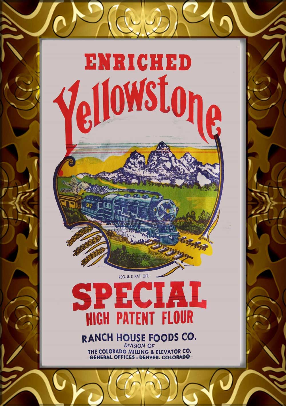
What gives? Well, one and all are examples of “feed sack art.” Those colorful logos on cotton feed sacks provided a healthy dose of Americana from just before the turn of the 20th century well into the 1950s.

Cloth feed sacks were the mid-1800s successors to the wooden barrels that had previously handled storage chores. Industrial sewing machines now made it possible to sew reliable seams. Although dubbed “feed sacks,” the bags were put to work carrying plenty besides animal feed. Among the contents: seeds, flour, sugar, tobacco, bath salts, corn meal, and even ammunition. While early bags were often burlap or jute, by the 1890s cotton was king. Cotton bags were more pliable, cheaper to produce, and reusable.

Actually, “repurpose-able” is a better description. No homemaker intended to refill her empty Blue Feather Potatoes bag with more potatoes. But with a good washing, and by picking out those sturdy seams, there were plenty of other uses for that good cotton–and there was plenty to use. The standard 100-lb. feed sack, when laid flat, measured approximately 37” by 43”. With enough bags, there was soon more than enough material on hand to sew up a variety of household necessities, from dish towels and bedsheets, to new curtains and quilt backings.

Just about the only thing early white cotton bags were less than desirable for: clothing. Initially, the logos and product information inked on the bags was there to stay. The only hope for removal: dousing them with bleach, or other “sure-fire” home remedies, before engaging in some vigorous scrubbing. If that didn’t do the trick, printed info was sometimes left as is. After all, who would see it? Only the disgruntled little girl heading off to school, knowing that her new set of drawers had “100 lbs. net weight” plastered across the posterior. (Patterned feed bags, which came into vogue for clothing use in the 1920s, solved the problem. Their labels and logos were either water-soluble ink, or on easily removable tags. This led to a surge in dresses, play clothes, aprons, and other types of feed sack clothing during the Depression and World War II years).

By the early 1940s, more than 30 companies were churning out feed sacks nationwide. There was an ongoing effort to come up with distinctive, uniquely-themed logos, sure to drum up buyer interest. This explains the warbling poultry and flying corncobs on some bags, which vied for attention with more traditional illustrations of farms and countrysides. 

Learning the ABCs, graphite, and watercolour

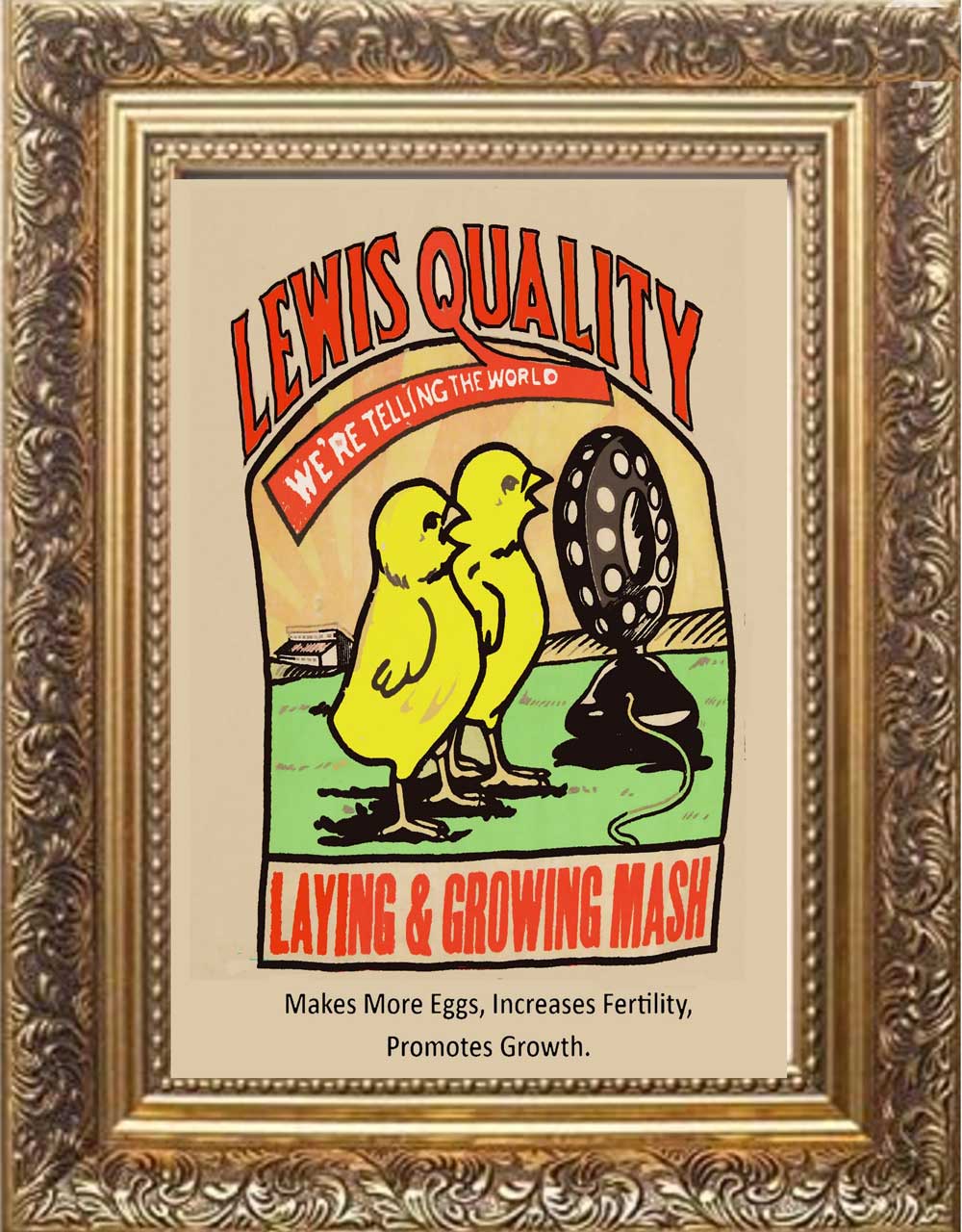
And they’re on the air! Chicken duo sings the praises of “Lewis Quality Laying and Growing Mash,” Lincoln, NE. (Image courtesy of Shari Aken and Hank Kuhlmann)

Learning the ABCs, graphite, and watercolour

Ring out the news: “Golden Bell Rye Flour,” Zwonechek & Aksamit Milling Co., Wilber & DeWitt, NE. (Image courtesy of Shari Aken and Hank Kuhlmann)

For today’s collectors, accumulating feed sacks requires pre-planning. As noted, they’re huge. Unless you have plenty of room to hang them (say, in an empty barn), much of your collection could remain unseen. But if it’s just the feed sack logo you’re interested in, an attractive and workable alternative is to frame and display just the logo portion. As for the remainder of the bag, there’s no need to try stuffing it into the frame or cutting it up to get at the logo (As feed sack prices can range from $10-$50, depending on condition, put away those scissors!). The answer to the dilemma is as close as your camera or phone. Just photograph the logos, then print them for display. This allows for size adjustment of the image to fit the frame. It also offers the option of touching up any undesired deterioration. The result: an eye-catching display, true to the source, but with the original feed sacks remaining intact.

With the introduction of equally sturdy, yet much less expensive paper and burlap bags in the 1950s, the use of cotton feed sacks declined. Their logos, however, continue to hold a nostalgic appeal for today’s collectors. They hearken back to a simpler, more peaceful time. A time when chickens could sing, and corncobs could fly.

Learning the ABCs, graphite, and watercolour

“I hear the train a-comin’.” Locomotive logo for “Yellowstone Flour” from Ranch House Food, a division of the Colorado Milling & Elevator Co., Denver, CO. (Image courtesy of Shari Aken and Hank Kuhlmann)

Donald-Brian Johnson is the co-author of numerous Schiffer books on design and collectibles, including “Postwar Pop,” a collection of his columns. Please address inquiries to: donaldbrian@msn.com

Horsing around: Collectible horse figurines

May 2025

SMACK DAB IN THE MIDDLE

Horsing around: Collectible horse figurines

by Donald-Brian Johnson

Horses are the stuff dreams are made of. “Trigger”. . .”Black Beauty”. . .”Misty of Chincoteague”. . .“Fury.” Horses are strong. They’re brave and loyal. Sometimes, they’re even funny, like “Mr. Ed.” To many folks, horses are considered members of the family (large ones). With each pulsing hoofbeat, each tossing mane, we’re reminded anew of their magnificence.

Horses first began trotting their way into the artistic landscape during prehistoric times; cave paintings of the animals date back about 17,000 years. Horse figurines came even earlier: miniatures carved of mammoth ivory emerged during the Paleolithic period (about 30,000 B.C.). More recently (“recent” = 2500 B.C.), figurines of horse-drawn chariots appeared in ancient Greek and Roman art. By the 14th century Renaissance era, an entire stableful of horse art was let loose into the pasture, including an enormous (and uncompleted) equine monument by Leonardo da Vinci. As the centuries progressed, horses found themselves playing supporting roles in a series of visual stories: field scenes, transportation scenes, battle, hunting and racing scenes, and plenty of sporting events.

Finally, during the 18th and 19th centuries, good horse sense came into play, and horses themselves became artistic focal points. Using anatomical drawings as reference, painters and sculptors were able to more realistically capture their bone structure, movement, and line. No more “rocking horse art,” with front and back legs fully extended. A better understanding of the variations in horse gaits meant artisans could successfully blend artistic license with reality. Now, when a horse sculpture seemed to come thundering toward you, it was hard to resist the urge to flinch.

By the mid-20th century, horse figurines had made it across the finish line as decorative must-haves for the home. Nearly every individual craftsperson or firm joined the horse brigade to create figurals that would meet with public approval. Some managed an entire roundup. The prolific Betty Harrington of Madison’s Ceramic Arts Studio went for artistically enhanced realism in such creations as her “Horse Heads” salt-and-pepper shakers. However, she was equally at home with interpretations less bounded by reality, as in her futuristic “Modern Colt,” with its gaunt figure and attenuated limbs.

Some ceramists like Muriel Joseph George of Josef Originals were comfortable closely mirroring real life (her horse figurals are actually more “realistic” than the human figurines for which she became famous). Other designers of the 1940s and ‘50s viewed reality as just a starting gate. The horse “basics” were there — the mane, the tail, the pounding hooves—but once that was set, it was time to kick over the traces. Several achieved success by overemphasizing defining characteristics. The glacially windswept locks on a horse by Howard Pierce are meant to be the “mane” attention-getter. It’s hard, however, to imagine a horse with this one’s oversize head and foreshortened body actually making a go of it in real life. With Roselane’s “Fantasy Horse,” it’s the tail that takes center stage, imaginatively lush and swooping to the floor. And, Marc Bellaire’s abstract dappled dobbin is wonderful to look at it, but, in reality, he’d have trouble balancing on those stubby little legs. Still, the image of “what a horse is” has become so deeply embedded in our consciousness that we immediately recognize and accept each of these interpretations as valid. Even decked out with Lucite tails (Elzac) or with multitudes of golden bows (Copa de Oro), we know what we’re looking at: “a horse is a horse, of course, of course.”


Learning the ABCs, graphite, and watercolour

Stylized Howard Pierce steed with windswept mane. 8-1/4” h. $200-225. (Image courtesy of the author)

Horse figurines could be made of whatever material sparked the imagination, from the traditional (ceramic, glass, metal, chalk, or plastic) to the less likely (papier-maché, leather). And, while many were static, others did double duty as TV lamps/planters, salt-and-peppers, cigarette lighters, and even hors d’oeuvres servers!

Fortunately, since many midcentury horse figurines were mass-produced, they remain readily available and affordable. With a bit of smart horse-trading, today’s collectors can easily corral a herd of blue ribbon winners!

Donald-Brian Johnson is the co-author of numerous Schiffer books on design and collectibles, including “Postwar Pop,” a collection of his columns. Please address inquiries to: donaldbrian@msn.com

Out of their shells: Collecting vintage egg cups

April 2025

SMACK DAB IN THE MIDDLE

Out of their shells: Collecting vintage egg cups

by Donald-Brian Johnson

Are you a pocillovist? Wait. Let’s rephrase that.
Do you collect egg cups? If so, you’re into pocillovy (from the Latin, pocillum ovi, “a small cup for an egg”).

Like many other serving dishes that nowadays are prized as collectibles, egg cups initially provided a practical solution to a perplexing problem. In this case, how to serve an egg with a minimum of morning frustration. A traditional bowl was too roomy. A plate was too flat. And so, the egg cup was born. Its sole purpose: to hold an egg safely within its confines. “Eggs-asperated” breakfasters around the globe breathed hungry sighs of relief.

Throughout their lengthy history (some egg cups date to ancient Pompeii), the servers have been fashioned of whatever proved handiest, and up to the required task. Wooden egg cups, from warm cherry to burnished ebony, are prized for their elegantly turned shapes, which bring out the natural beauty of the wood. They’re often adorned with silver or ivory protective edge trim. Metal egg cups have been fashioned of silver, pewter, aluminum, gun metal, and a host of other metallic possibilities. Designs range from sleek, undecorated examples basking in simple, shiny glory, to those embellished with piercings, embossings, and engravings. China and porcelain cups were produced by name manufacturers including Spode, Goebel, and Wedgwood.

They were hand-decorated (or, in the case of less pricey competitors, decal-decorated), with fruits, flowers, and other sprightly images. Pressed glass cups, in clear colors or marble-like “slag,” were less expensive than china, and could feature molded-in patterns or be shaped in such apropos forms as chickens, ducks, and bunnies. Also inexpensive: plastic egg cups, which came into vogue in the 1930s, with the development of durable plastic formulas. For the most careful eaters, there were even rubber, straw, and papier-maché egg cups.

Standard egg cup shapes run the gamut, from those identified by design (“Footed”; “Bucket”) to those identified by purpose, such as the “Goose and Chicken.” This “double cup” had a smaller end just the right size for a chicken egg, with the larger end intended to hold a goose egg. The real egg cups to beat, however, are novelties and figurals.

Even the most hard-boiled collector cracks a smile when greeted by egg cups that pay tribute to such pop culture icons as Mickey Mouse, Snow White, Bugs Bunny, and those ever-purply Smurfs. The cups are a special hit with Baby Boomers, conjuring up childhood recollections not that far in the past.
Many are in traditional cup shapes, with the character likeness an applied illustration. The really good eggs, however, are figurals, often of heads (a natural), but sometimes full body depictions, such as “Noddy.” He’s the winsome scamp who now and then showed up in the Downton Abbey kitchen.

Other popular themes are fairy tale and nursery rhyme favorites, animals, buildings, and vehicles such as toy trains. And, when Easter egg time rolls around each year, you’ll find a flock of chicken cups and a hutchful of bunny cups on antique dealers’ shelves. Giving these to wide-eyed youngsters each Easter—complete with an oversize chocolate egg—was a tradition in the early 20th century. Candy maker Fanny Farmer even made sure recipients knew where that delicious chocolate was coming from: its duck cups were emblazoned with the company name. In recent years, the tradition of an annual Easter egg cup has been carried on by candy companies such as Cadbury’s.


Learning the ABCs, graphite, and watercolour

“I’m An Egghead” ceramic novelty cup by Kreiss. (Image courtesy of the author) Egg cups courtesy of Jan McKelvie.

Once upon a time, long before the days of Egg McMuffins, breakfast meant a well-stocked and welcoming kitchen table—including eggs in their individual cups. Egg cups had folks starting each day with a smile. So this Easter morning, why not treat yourself to a leisurely breakfast? You’ve probably got at least one egg cup stashed away somewhere. Break it out, and bring it back to the table where it belongs. And keep your sunny side up.

Happy Easter!

Donald-Brian Johnson is the co-author of numerous Schiffer books on design and collectibles, including “Postwar Pop,” a collection of his columns. Please address inquiries to: donaldbrian@msn.com

Batteries not included – some toys keep going and going…

March 2025

SMACK DAB IN THE MIDDLE

Batteries not included – some toys keep going and going…

by Donald-Brian Johnson

Toys are for kids, right? Well… except those intended for “kids at heart,” like the battery-operated figures which hopped off store shelves and into customers’ shopping bags in the 1950s and ‘60s. Parents took one look at the gleeful “Monkey Clanging Cymbals,” or the dainty “Dog Lady Watering Flowers,” and said to themselves, “Now wouldn’t the kids get a kick out of that?”

And they did—for awhile, at least. Battery figures required little interactivity. You turned on Mr. Monkey, watched him clang his cymbals, and then what? Back in the box he went.

The truth was, as toy manufacturers quickly discovered, that kids weren’t the ones getting a kick out of these battery wonders. It was the actual buyers (i.e., their parents) who were getting the kick, thinking how much fun it would have been to own one of these toys back when they were kids. That’s why so many of the battery ops eventually found their way to a shelf in Dad’s den. And that’s why so many of the figurine themes were a bit further afield than what authentic kids might be thinking about. (Really, how many boys and girls spent their days dreaming about owning a “Charley Weaver Bartender” or a “Pipe Smoking Rat”?)

The earliest “battery toys,” dating from just after World War II, were essentially “mechanicals.” Friction, or a wind-up spring-driven motor provided any movement. Battery-powered components were just there to offer a little something extra – car head-lights that actually lit up, or a noisy police siren.

Wind-up toys only ran as long as their wind-up lasted. Then it was time for another turn of the key. Japan’s intro-duction of miniature battery-powered motors in the late 1940s meant that toys could essentially run forever (or at least until their batteries wore out). Even better, battery-operated toys could be designed to perform what-ever imaginative actions came to the designer’s mind. “Piggy Cook” could merrily sprinkle seasoning on his latest entrée. . . “Teddy The Boxing Bear” could deter-minedly attack his punching bag… and the “Down The Hatch Sea Captain” could send another healthy slug…well, “down the hatch.” With some battery figures, the actions were even more ingenious: Magnetic fish helped the “Fishing Bear” reach his daily limit; “McGregor the Cigar Smoker” actually blew “smoke” from his cigar, while the “Bubble Blowing Bunny” did just that.

Learning the ABCs, graphite, and watercolour

All set to sprinkle on the seasoning: “Piggy Cook.” (Image courtesy of the author)

Learning the ABCs, graphite, and watercolour

A crashing success: The “Monkey with Cymbals” rolls his eyes each time the cymbals clang. (Image courtesy of the author)

 Although some battery ops carried domestic company names (Cragstan, Ideal, Marx), the majority were manufactured in Japan, and then made available to U.S. distributors. While many imports carried no maker mark, one of the best-known Japanese manufacturers, Masudaya Modern Toys, utilized a diamond logo, encasing the letters “M-T” (During the space-age ‘60s, one of M-T’s most popular creations was the 15-inch “Giant Sonic Robot,” which came complete with whistling sound effects, and an array of flashing lights).

Originally, battery figures were very budget-friendly, retailing at $20 and under. So why aren’t today’s store windows filled with rows of grinning Charley Weavers? Well, the move to plastic in the late 1960s meant tin battery toys could now be manufactured even more inexpensively, resulting in greater profits at the same selling price. Plastic toys proved more reliable, too, not subject to the mechanical malfunctions (and rust) which plagued metal toys.

While today’s collectors are unlikely to find any battery toys at $20 and under (any working ones, that is), prices remain relatively friendly in the $100-$200 range (although Holy Grails like the “Sonic” can command up to $5,000). Original boxes, which often include operating instructions, add to the value. While minor imperfections, such as corroded battery terminals, can often be easily remedied, toys with non-working major functions are best left in the hands of hobbyists with plenty of skill and lots of time. That’s why it’s best to test out your favorites before purchasing. And be sure to bring along a few batteries. As the boxes always said, “Batteries Not Included.”

Donald-Brian Johnson is the co-author of numerous Schiffer books on design and collectibles, including “Postwar Pop,” a collection of his columns. Please address inquiries to: donaldbrian@msn.com

Collectible calendars: Chronicling the days of our lives

February 2025

SMACK DAB IN THE MIDDLE

Collectible calendars: Chronicling the days of our lives

by Donald-Brian Johnson

It’s 2025! Out with the old, and in with the new! Clean those closets! Dump those dresser drawers! Jettison the junk and start the new year with a clean slate!

Wait a minute. . .you’re not going to throw away that nifty wall calendar, are you? Not so fast!
Wall calendars fall into the category of “collectible ephemera,” which pretty much says it all. “Ephemeral” means something short-lived, or transitory (In other words, here today, gone tomorrow or thereabouts). Like Christmas cards, Halloween decorations, sheet music, homemaking magazines, and other paper goods, wall calendars were never intended for lengthy life spans. Once they’d served their purpose of marking the days, it was off to the trash heap, as an up-to-date model made its debut.

Except. . .a lot of those wall calendars were so gosh-darn appealing that folks couldn’t bear to part with them. Maybe it was that heart-tugging illustration of a freckle-faced lad with a frisky puppy. . .or the promo for a once-familiar, now long-vanished local business. . .or even the coy glance of a perky pin-up girl, on the calendar that once held pride-of-place over Dad’s workbench. The days may have disappeared, but the memories lived on.
Calendars have been around for awhile. A long while. The oldest thus far recorded dates from 8000 B.C., discovered during an archeological dig in Scotland. Of course, that one was carved in stone. Paper calendars had to wait until the discovery of paper (or, at any rate, papyrus). Even then, the tedious task of hand-lettering meant that calendars were primarily the province of scholars, in need of details on phases of the moon, liturgical observances, and the like.

And then, in 1440, along came the printing press, and calendars could be printed. A later development: broadside printing, which meant calendars could be printed on a single sheet of paper. By the late 1800s, calendars were within almost every budget, and businesses took note. If folks were going to hang calendars with a pretty picture on their kitchen walls, why not calendars that also included, in addition to that pretty picture, a prominent ad for the local gas station or funeral parlor? It would, after all, be up all year, subtly implanting a message ready to emerge when the time was right (Need a new Frigidaire? Who to call? Well, how about “Berg Hardware”? It says right on the calendar that they carry refrigerators. And look—here’s their phone number!).


Learning the ABCs, graphite, and watercolour

Lamb, and lady in lamb’s-wool jacket. A 25th anniversary calendar from John Willuhn’s Red & White Foods, 1946. (Image courtesy of the author)

Learning the ABCs, graphite, and watercolour

Young music-makers take center stage on the 1953 Lierly’s Frozen Food Locker calendar, Primrose, NE. (Image courtesy of the author)

To attract consumers, businesses went all-out in selecting the most appealing calendar art possible. In many cases the artwork dwarfed the actual calendar. After all, the object was to get those calendars prominently displayed. The illustrations, ranging from the scenic (trees in gold-red autumn splendor, winter wonderlands), to the heartwarmingly homey (the first day of school, bedtime prayers, kids at play), are a primary source of interest to collectors. Also sought-after: intact calendars, with no pages missing or scribbled on. An especially attractive mid-century example in mint condition can be yours for under $20. Many with minor damage are available for far less, particularly when sold in lots at auctions or estate sales.

Well into the late 20th century, wall calendars retained their advertising allure, even with the advent of television and radio. At most businesses, calendars were available at no charge, since they were inexpensive to produce, and served as an ongoing source of free promotion. You could always turn off the TV. Or you could turn off the radio. But you couldn’t turn off the calendar. That “yours for the asking” tradition continues today.

Yes, a new year is here, and with it a new wall calendar. Its pristine pages are filled with the promise of wonder-filled days ahead. Or, as “Anne of Green Gables” author L. M. Montgomery once put it, “Isn’t it nice to think that tomorrow is a new day, with no mistakes in it yet?”

Donald-Brian Johnson is the co-author of numerous Schiffer books on design and collectibles, including “Postwar Pop,” a collection of his columns. Please address inquiries to: donaldbrian@msn.com