
February 2026
SMACK DAB IN THE MIDDLE
My funny valentines - Ribticklers from Topps
by Donald-Brian Johnson
“You’re my funny Valentine,
sweet comic Valentine,
you make me smile with my heart!”
- Lorenz Hart, 1937
In the musical Babes in Arms, the “Valentine” being sung about was actually another character. And, just like the lyrics say, he was both “sweet” and “comic.” But when it comes to the cards which fill our mailboxes each Valentine’s Day, “sweet” and “comic” didn’t always go hand in hand.
Recently, while poking through souvenirs from bygone days, I came across a carefully preserved packet of Topps “Funny Valentines,” dating from 1959 and 1960. When it came to the last word in knee-slapping hilarity among young Baby Boomers, Topps was definitely tops!
The Topps format was simple: each card had a colorful front with a sweetly traditional message: “You’re like sugar candy!” The comedy came on the reverse: “Sticky and gooey!!”
Cards like these never made it to the hand-decorated valentine box which held a place of honor on each grade-schooler’s desk. These were cards for trading, just like Topps baseball cards—and trading took place out on the playground during recess. Discovery during class meant after-school hours diligently scribbling “I will not. . .” (etc.) over and over on the chalkboard.
Although Topps “Funny Valentines” were brand-new to bright-eyed schoolkids, the idea behind them had been around for awhile. Ever since traditional valentines were introduced in the 1840s, “vinegar valentines” with much sourer sentiments were also on the market. These cards were actually sent, often anonymously. A quick check of some opening lines (“To A Wolf”; “To A Professional Scandal-Monger”), and it’s easy to see why. Apocryphal stories abound of vinegar valentines leading to fistfights between formerly friendly neighbors, and postal employees disposing of the cards before they reached their intended recipients.
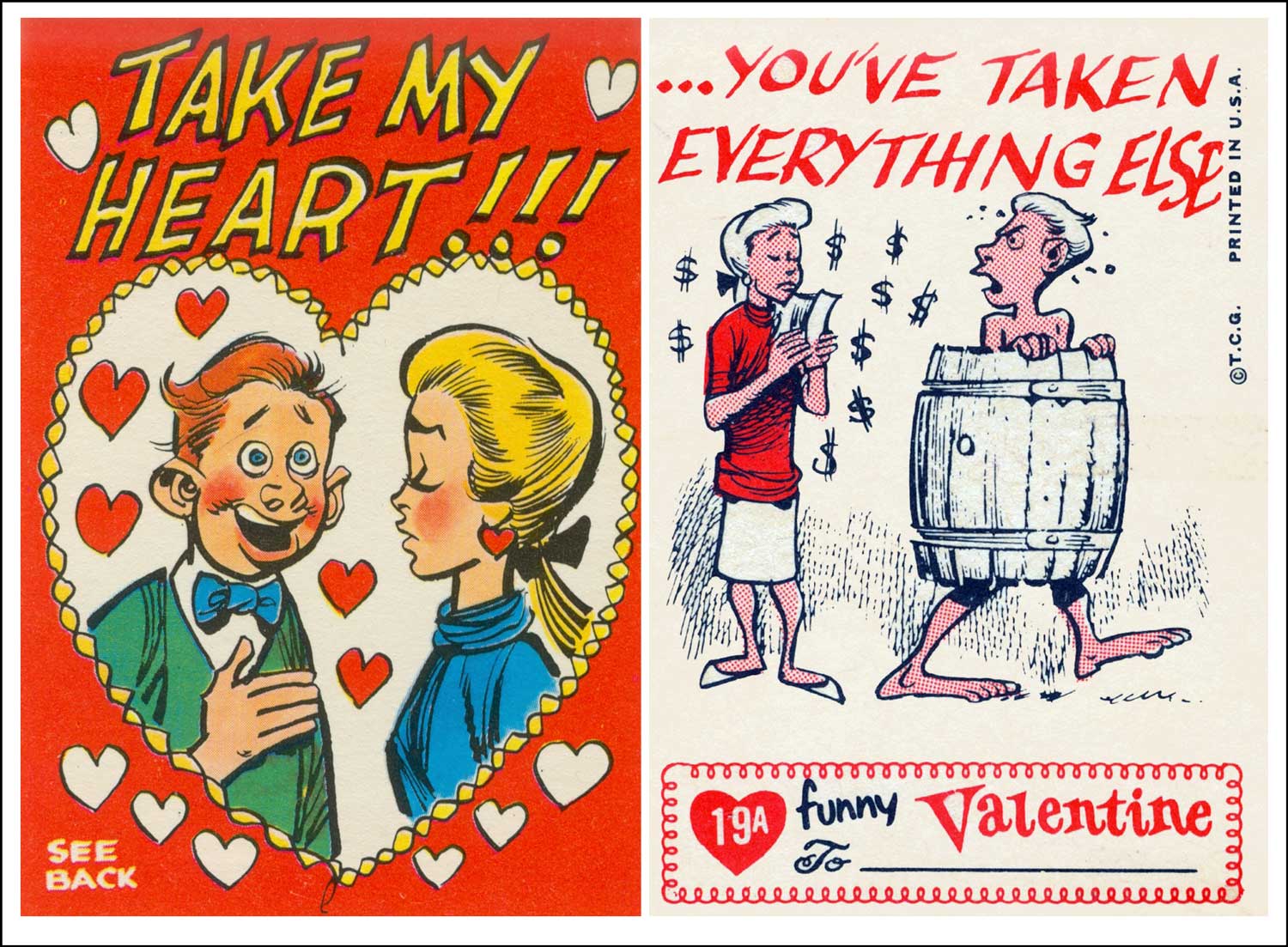
Topps #19A (FRONT): He sounds sincere. . . (BACK) . . .and he probably is! (Images courtesy of the author)
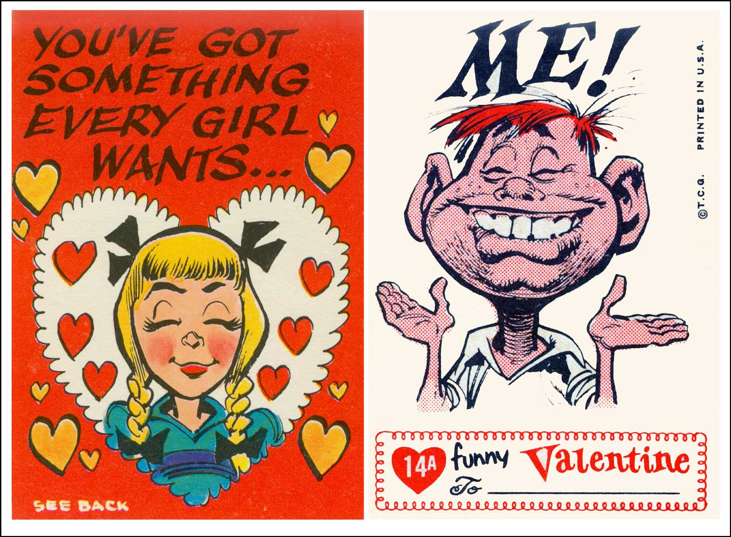
Topps #14A (FRONT): And what would that be? (BACK): Probably not this! (Images courtesy of the author)
Collecting both complete sets of Topps Funny Valentines meant chewing an awful lot of big sticks of gum. In 1959, 66 were released; another 66 followed in 1960. Fortunately, the cards were numbered, making life easier for card traders then and collectors today (the letter “A” by the 1960 numbers distinguishes them from the 1959 ones). Davis also designed a series of “Giant” Funny Valentine cards in 1961, but their size made them less handy for trading (and more trouble to sneak into the classroom). Most Funny Valentines, even those in mint condition, sell online for $2-$3. While a jump from their original nickel price, the cards remain a sweetheart of a deal.
In the early years of “vinegar valentines,” an outraged New York Times editorial referred to their senders as “hydra-headed monsters who gloat over distorted effigies of human nature and cruel cutting things in rhyme.” By the time of their mid-20-century moment in the sun, Topps Funny Valentines had drained away all that Victorian vitriol, leaving in its wake cards that were silly enough to chuckle over, wild enough to whisper about, and just the thing for would-be young “rebels:” sweet (well, maybe not so sweet), comic valentines.
Now, does anyone have a #3 they’d like to trade for a #64-A? Meet you at the playground!
Topps card humor was much tamer. Sort of what you’d find in MAD magazine, which was especially fitting, since they were the work of a longtime MAD illustrator. Jack Davis first achieved acclaim in the early ‘50s for his depictions of the “Crypt-Keeper” in the lurid EC Comics favorite, Tales From The Crypt (“They looked at my work,” said Davis in a Wall Street Journal interview, “and it was horrible, and they gave me a job right away!”). His ability to bring zany characters to life—and to do so quickly—caught the attention of Harvey Kurtzmann. When Kurtzmann’s first issue of MAD hit the newsstands in 1952, so did Davis’ illustrations. In a Davis drawing, heads were oversized, facial features were exaggerated, and clothing was rumpled. His detailing was careful, but appeared off-the-cuff, and his scratched-in, somewhat unfinished backgrounds added dimensionality.
Donald-Brian Johnson is the co-author of numerous Schiffer books on design and collectibles, including “Postwar Pop,” a collection of his columns. Please address inquiries to: donaldbrian@msn.com